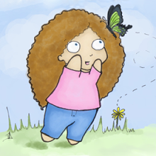
I was going to make a little post about how I'd made some changes to the side bar and the navigation links and how just because I thought everything was a little cleaner and prettier and MORE AD-FOCUSED now doesn't mean that you guys will necessarily like it, and you're perfectly entitled to scream at me and tell me to change it, and I'm very susceptible to peer pressure, so I probably will, but I thought, "Ana, this post needs a picture of a frown," so I went to Google image search and typed in frown and I immediately saw this little guy and I knew he was perfect, so I clicked on the link to visit the page and the pic is hosted on www.twilightguy.com.
And if I went to the police station tomorrow and told them GOOGLE IS STALKING ME, which I would have every right to do, they'd think something was wrong with me. I swear.
OK, so...changes. I hate it when people make changes to their blog layout, and I'm sure you do to. All right-thinking people do and my readers are nothing if not the highest echelon of taste and refinement. And yet, here I am writing the dreaded "stuff has been changed" post. Sorry.
Not a whole lot has changed, I swear, and I think it'll be for the best. First and foremost, I added a "Blog Navigation" page to the navigation bar at the top of the blog. I moved over the blog calendar widget to that page because I noticed that the widget (a) didn't always load on all browsers all the time and (b) sometimes slowed the page loading down a bit if it was in a bad mood. If you're interested in checking the blog calendar, you can pop over to the blog navigation page, or you can subscribe to the calendar RSS feed directly via the little orange button in the bottom-right hand of the calendar widget.
Secondly, I also moved over the GoodReads Reading Challenge widget and the GoodReads Quotes widget over to the "About Me". As much as I like those widgets, I have to admit that the reading challenge is something that basically only I am interested in, so it was pretty much a bit "wank widget" and why should I inflict that on you gentle readers? And the quotes, well... I like a good quote as much as the next person, but I have to admit that I rarely enjoy having them inflicted on me by other people. Sure, occasionally I see some neat gems to repeat, but more often than not they just don't resonate with me, or - worse - I completely disagree but don't have any vehicle to really respond to the quote, which leaves me feeling disoriented and helpless. It's like a drive-by smugging. So, anyway, they're there on the About Me page if you liked them and want to visit them and keep them company, but otherwise you can carry on about your business.
Thirdly, the Google Friend Connect and the ads, and everything else that was at the bottom of the blog is now a sidebar item. This is because when I want to see the bottom of the comment thread and I press the "End" button on my keyboard, I don't want to then have to scroll up to get to the comments. I'm sure you all feel the same way, and I don't know how I didn't notice that earlier. You are all very patient with me to have not said something before this.
Fourthly, and you may have noticed this already, the Amazon ads and Google ads on the sidebar have both been expanded to a 600 pixel length. On the one hand, I really like having the advertisements because in theory I might someday make $5 off of my blog which I can then blow on more eBooks to deconstruct. (I haven't actually made any money yet because - come on - who seriously clicks on blog ads??) I also love what the content-linked ads can provide to a discussion - for instance, the top Amazon ad on the Twilight posts is now a book called Bella Should Have Dumped Edward
So I went ahead and made these changes because, hey, I think it looks better, but I'm also open to suggestions, particularly if the new ad scheme makes you want to commit seppuku. I don't want to lose what are clearly the best readers on earth in my vain attempts to break even on my eBook addiction, nor could I bear it if all of you packed up and left because you were here for my alliteratively-named Quotable Quotes. Drop me a line, or post a comment, on what you think of the new format and I'll try to find something that works for everyone, assuming Google doesn't find me first.


3 comments:
Actually, Google kind of is stalking you -- here's an interesting TED talk on that:
http://www.ted.com/talks/eli_pariser_beware_online_filter_bubbles.html
I haven't been around long enough to notice the layout changes (plus I generally stay in Google Reader), but I don't hate it based on its own merits. If you change it again, I might get cranky :)
"Drive by smugging" is a wonderful phrase.
...and here I thought "Google is stalking me" was about how shortly after you decided to use the Mr. Happy Gets Frowny ViA Photoshop pic you discovered Google's Mr. Men doodles in celebration of Roger Hargreaves's birthday....
Matt Smyczynski Thanks for the TED talk link - Work Friend recently introduced me to those TED talks. Very cool. Potentially addictive.
We should make "Drive by Smugging" t-shirts. Everyone else has a CafePress site, after all. :P
Nicole J. LeBoeuf-Little Eek! That makes me even more paranoid! Somehow I'd missed that. o.O
Post a Comment